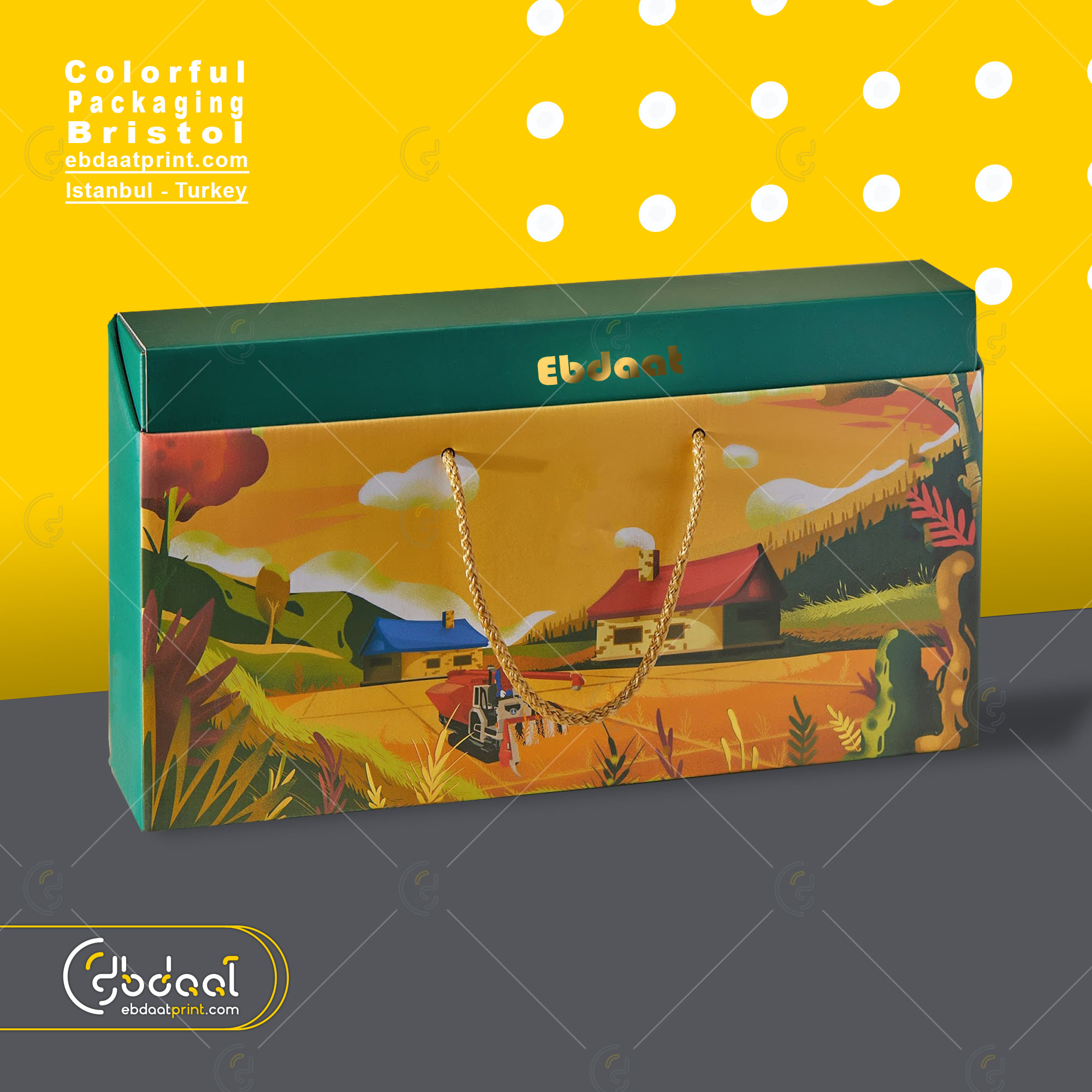
How to Prepare Print-Ready Files for Packaging
A step-by-step guide to preparing your artwork files for professional printing. Avoid common mistakes that delay production.
The fastest way to delay a print run isn't waiting on stock or finishing — it's an artwork file that fails prepress checks. A few minutes of file prep saves days at the press, and the rules are the same whether you're printing 50 cards or a full pallet of rigid boxes.
Here's exactly what we look for when your file lands in our prepress queue.
1. File formats we accept
Send us one of three formats, in this order of preference:
- PDF/X-1a or PDF/X-4 — the print industry standard. Fonts embedded, transparency flattened, colour profile attached. Both InDesign and Illustrator export to this.
- Native Adobe Illustrator (.ai) — best for vector-heavy work like packaging dielines and logo cards. Outline your fonts before sending or include the font files.
- Native Photoshop (.psd) — only for raster-heavy artwork (photographic packaging, full-bleed imagery). Save with layers preserved so we can fix issues without bouncing the file back.
We'll happily review TIFF and large JPG files too, but PDF/X is what your designer should be exporting for production.
2. Bleed: 3mm everywhere the artwork meets the trim
Bleed is the bit of artwork that extends past the final trim line. Without it, the slightest movement during cutting leaves a thin white edge — the kind of detail that makes premium packaging look cheap. We require 3mm of bleed on every side. For a 90 × 50mm business card that means setting your document up at 96 × 56mm with the design extending to the full edge.
3. Resolution: 300 DPI minimum at final print size
Resolution is measured at the size the image will actually print, not the size of the source file. A 300 DPI photo blown up to 300% prints at 100 DPI — pixelated. Run a quick check: in Photoshop, Image → Image Size and confirm 300 px/inch at the dimensions you'll actually use. For vector logos and type this doesn't apply — vectors stay sharp at any size.
4. Colour mode: CMYK, with a Pantone library if you have one
Screen colour is RGB. Print colour is CMYK. If you submit an RGB file we'll convert it, but the conversion never matches the screen exactly — vibrant blues and greens shift the most. Do the conversion yourself and proof it before sending. For brand colours, send the Pantone reference (e.g. PMS 287 C) — our presses are G7 calibrated and we hit Pantone within 2 ΔE on coated stocks.
5. Safe zone: keep important elements 5mm from the edge
Mirror of bleed: there's a 5mm "safe zone" inside the trim line where you keep anything you can't afford to clip. Logos, body text, QR codes, legal copy — all stay inside the safe zone. The bleed catches mis-cuts; the safe zone catches mis-folds and assembly tolerance.
6. Common mistakes — and how to avoid them
- Hairline strokes set in Illustrator's "0.25 pt" default. Anything under 0.5pt drops out at press. Set strokes to 0.75pt minimum.
- Type too small to print cleanly. 6pt is a hard floor for legibility on coated stock; 7pt for uncoated.
- Black set as
R0 G0 B0or pureC100 M100 Y100 K100. Use a rich black:C40 M30 Y30 K100. Looks deeper, no banding. - Embedded preview JPGs instead of the original. Always export from the source file, not a screenshot.
- Multi-page PDFs in the wrong order. Front cover, back cover, then interior in reading order.
Every file you send us gets a free prepress review — we flag bleed, fonts, resolution, and colour issues before the press starts. But you'll get your job back faster (and cheaper, if rush production is on the table) by hitting these on the first send.
Ready to print? Request a quote at ebdaatprint.com/request-quote and attach your file — we'll review it on us and reply with a detailed quote within one business day.